Showing posts with label Art Direction. Show all posts

Saturday, 21 January 2012

Supporting Documents- 'Making Of' and Character Bible

Atom pancakes would like to share the documents supporting our animation, they feature the behind-the-scenes which helped us produce our final short.


If you like the character Arthur Winters, this document will explain how our studio decided upon the design and show some of the early stage drawings of him .

The Final Chapter - Character Bible


Enjoy!

Thursday, 15 December 2011

Cigarette Smoke Dynamics Simulation Test v.1

Lately, I have been also testing some effects for our animation, after following a tutorial, i was able to play around and create cigarette smoke. Here is the test:


Thursday, 22 September 2011

2d Graphical Influence

We have a lot of work to do, but we are starting to move forward with more confidence and in the next week or so, the current problems we have should be resolved. Before we show more storyboards, artwork and character sketches, we'd like to share some ideas we have for art style. A big part of our animation is 2d graphical elements which need to tell a meta-narrative and it is my job to direct this section. That means, narrative, art work and final arrangement. 

Below, I've outlined some influences for the current narrative. This section of the animation has to feel different, yet familiar with the crime genre.

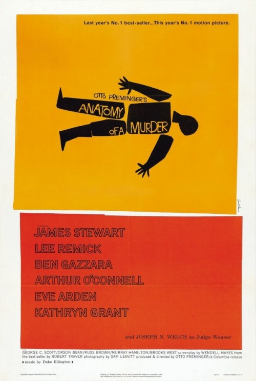
Saul Bass
Bass has become an iconic designer in the history of graphics. His simplistic posters broke all conventions when first created and even today have been influencing contemporary artists. His most famous works, stemmed from the films of Hitchcock, still demonstrate how impeccable and intelligent simple ideas can be.


Olly Moss
Possibly one of the greatest graphic designers of our generation, Moss combines his love of film and games with intelligent design. His work ranges from movie posters to game covers, and it looks as if his work will only become more and more popular.


Mad Men
One of HBO's latest masterpieces is the superb Mad Men. Set in the slick 60's of the American Ad world, the story of Mad Men is complete and perfected in every way, even down to the titles. The 37 seconds of graphics demonstrate the world of Mad Men perfectly. Simple, strong and slick. Check out the article below for more information on the preproduction.


The Legacy of Saul Bass and Movie Title Design
Ever since Bass demonstrated how simple design could be, modern films have been replicating it. The below links will give you an insight into the design of some of these titles.


The Thomas Beale Cipher
This short was posted by Tom Beg last year and instantly I fell in love with it. The style, texture and unique approach to story telling make it an incredible watch. This is similar to what I want to create with out 2d work. It needs to be simple to read and scream style, immediately telling the viewer about the narrative and the genre.


You can find out more on the project at http://www.thomasbealecipher.com/

Art Direction and Style

Today's update on art direction and style is a look at the superb short "Alma." This short by Rodrigo Blaas has a stunningly dark world and an extremely creepy narrative. However, the reason why I think it is an important piece to study is it's style. The real stand out feature of this film that I feel is relevant is it's textural quality. These small details are what we need to achieve, they take the animation to the next level. The mix of realistic design aesthetic and unique character form make this piece stand out beyond most shorts.


Alma from Rodrigo Blaas on Vimeo.

Check out the official site to get a closer look - http://almashortfilm.com/


A Gentleman's Duel
We looked at this short a while ago, and it wasn't until today that we realised it follows a very similar style to our new story. The English character is the perfect stereotype of the classic "gentleman" and so our own writer must exhibit some these qualities. The style has a very clean look, with soft forms and highlighted faces on geometry. This can be seen within the characters faces, they are smoothed but accentuated by the flat planar forms seen on the nose. Check out this article for a great behind the scenes look at the short -


The animation was created by Blur studios and demonstrates not only great character design, but amazing style. The beautiful setting adds to the comic narrative perfectly as we watch these two giants battle for a girls affection. 


This is also a short that we should study closely as it is animated with amazing timing. The characters movements and facial animation are what make the narrative work so well, and with one character we must ensure that we animate to perfection.

Team Fortress 2
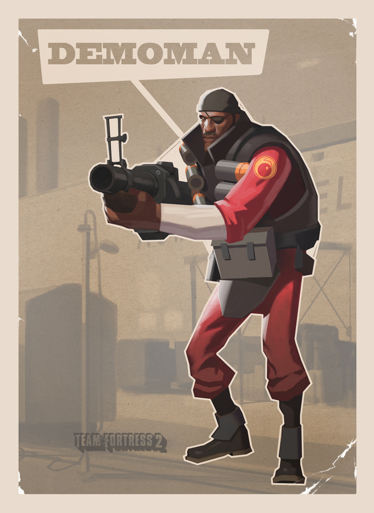
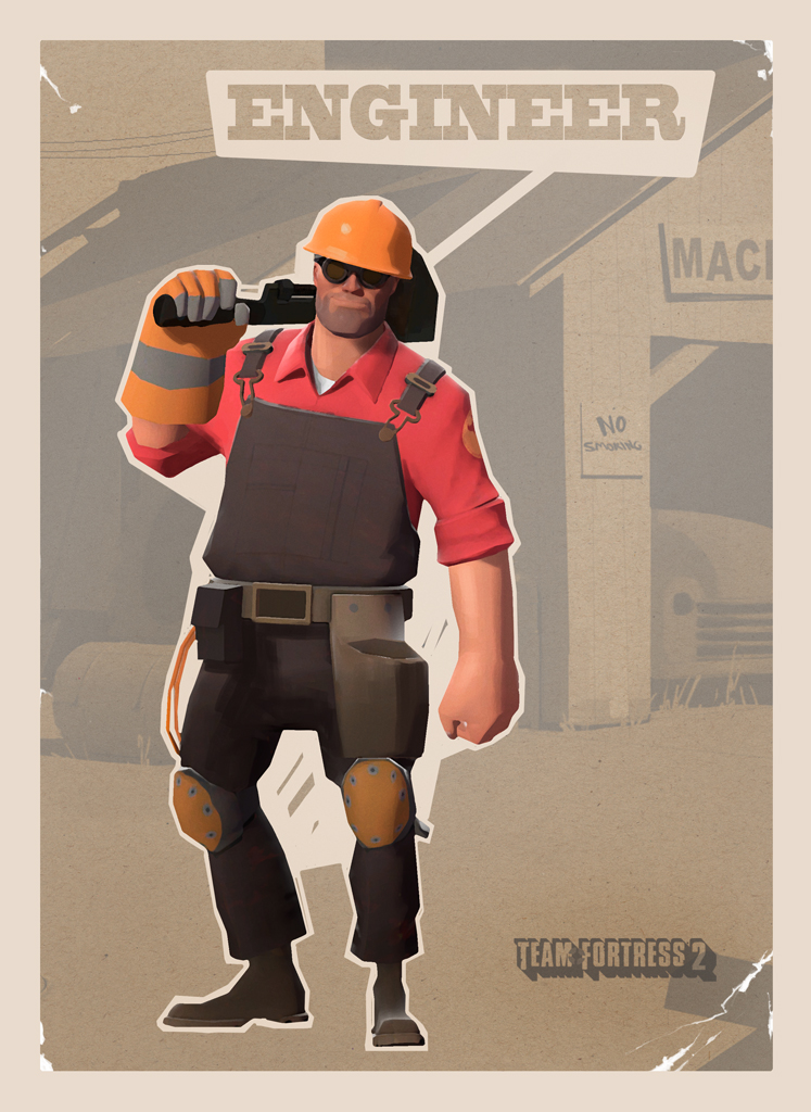
This game is mentioned almost every project as a source of inspiration for art direction. But it is something that we can really study as it is a game that has been designed beyond belief. The game itself is great fun, but it stands out because of its art direction. The characters are designed to the smallest detail, all unique and stunningly modelled. Their silhouettes allow them to stand out in the chaos and they follow similar rules to the film above. The characters are clean, both in texture and form. The angular designs often allow for definition, but they are not in anyway off-putting. This link gives an idea of how well crafted the characters are -


Check out the short below to see not only the designs in action, but the comedy created with such great characters. Each character has been animated in a short animation like the one below.

Tuesday, 30 August 2011

Art Direction - Part I

I realised that we haven't fully explored the idea of art style with our new narrative. And as Art Director that is my responsibility so hopefully over the coming days I can post an array of stuff that suits the world we want to create. I'd also love to see our preproduction stage allow us to create a whole bunch of amazing art work which will help sell our work.

A Gentleman's Duel
We looked at this short a while ago, and it wasn't until today that we realised it follows a very similar style to our new story. The English character is the perfect stereotype of the classic "gentleman" and so our own writer must exhibit some these qualities. The style has a very clean look, with soft forms and highlighted faces on geometry. This can be seen within the characters faces, they are smoothed but accentuated by the flat planar forms seen on the nose. Check out this article for a great behind the scenes look at the short -


The animation was created by Blur studios and demonstrates not only great character design, but amazing style. The beautiful setting adds to the comic narrative perfectly as we watch these two giants battle for a girls affection. 


This is also a short that we should study closely as it is animated with amazing timing. The characters movements and facial animation are what make the narrative work so well, and with one character we must ensure that we animate to perfection.

Team Fortress 2
This game is mentioned almost every project as a source of inspiration for art direction. But it is something that we can really study as it is a game that has been designed beyond belief. The game itself is great fun, but it stands out because of its art direction. The characters are designed to the smallest detail, all unique and stunningly modelled. Their silhouettes allow them to stand out in the chaos and they follow similar rules to the film above. The characters are clean, both in texture and form. The angular designs often allow for definition, but they are not in anyway off-putting. This link gives an idea of how well crafted the characters are -


Check out the short below to see not only the designs in action, but the comedy created with such great characters. Each character has been animated in a short animation like the one below.

Friday, 5 August 2011

Art Direction Influence Maps

One of the subjects we discussed on our last meeting was the direction in which CG World will take. After a few options, Jordan Buckner, our Art director supported by all team members decided to go with a Pixar style animation, because not only it has a commercial look but also it is easier to connect with the audience via comedy gags.

Here is a couple of influence maps showing how we want our animation to look: